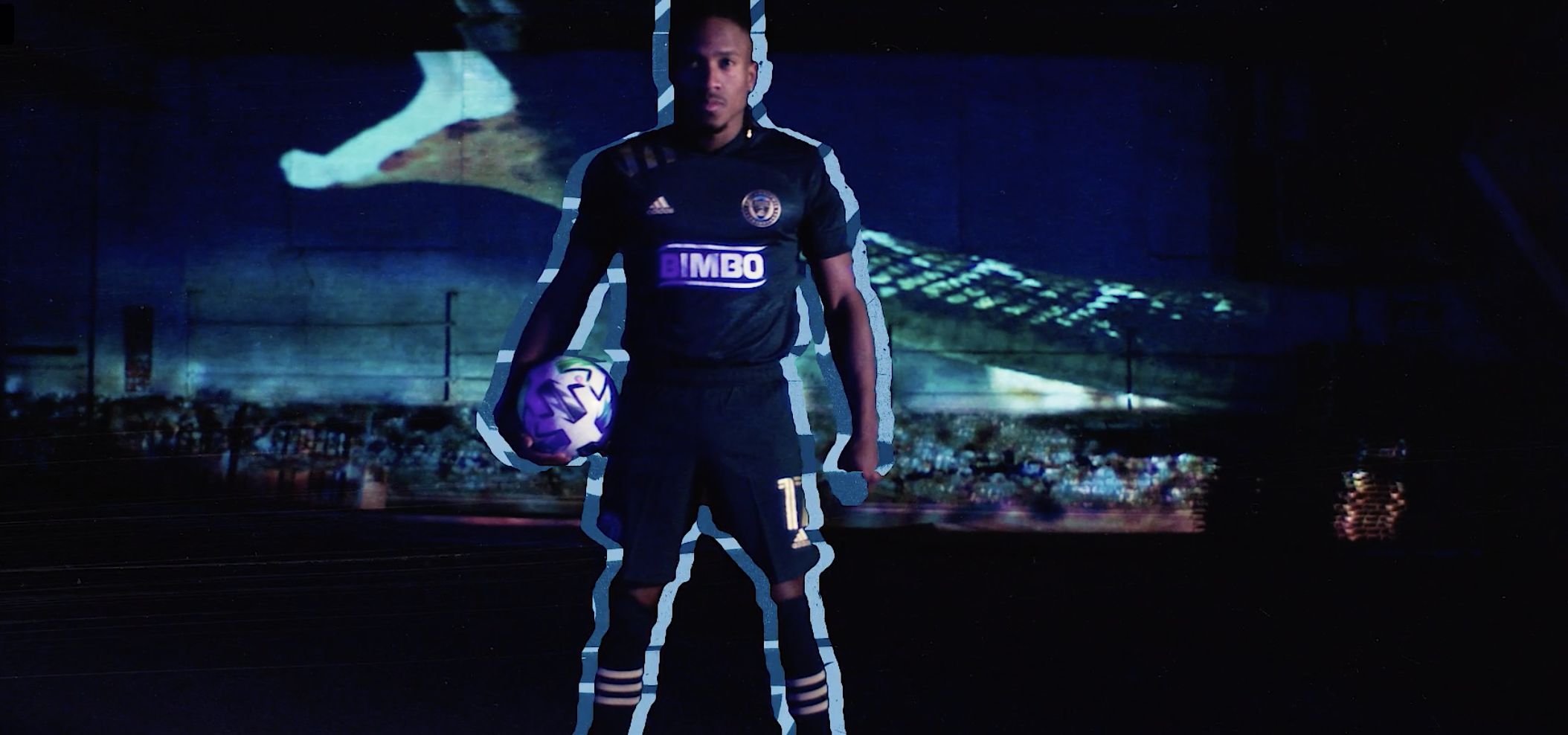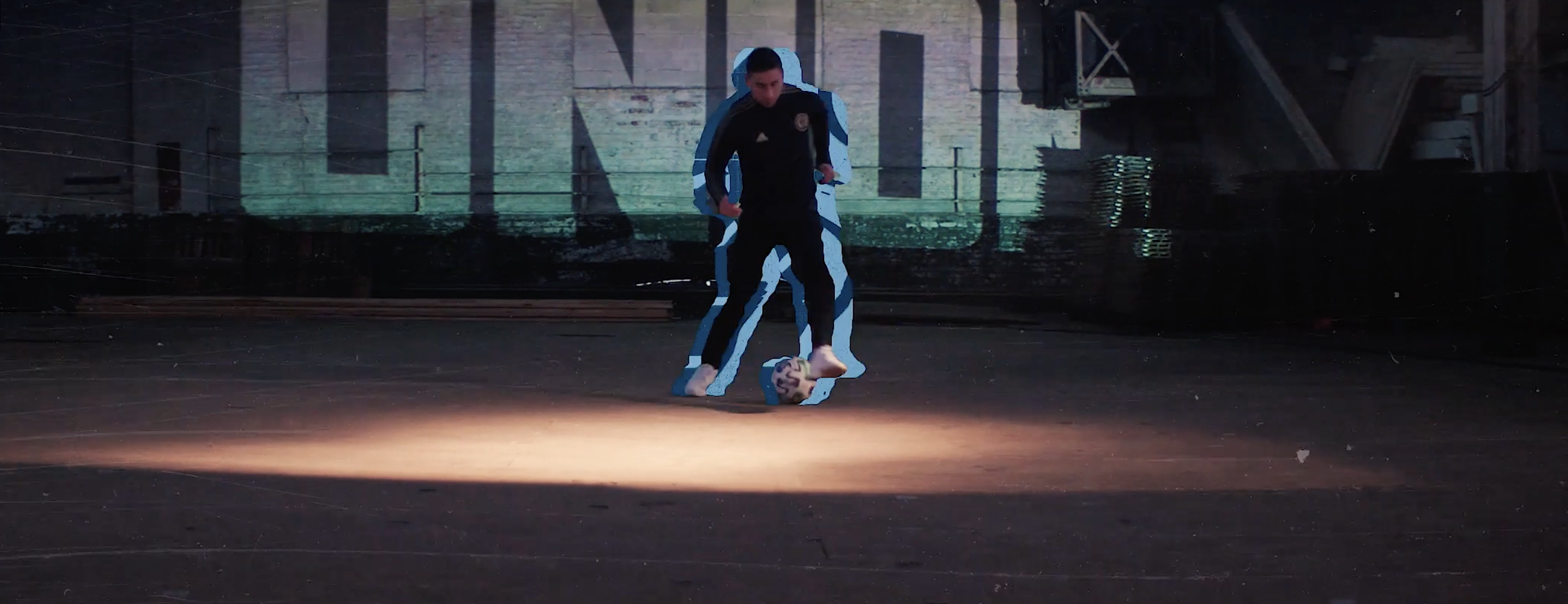
Graphically I think we could go in a myriad of different directions and I think there’s further conversation needed with the Creative team to stay within brand standards. But I do believe that we can make the energy involved with the animation around the graphics, exciting and uplifting to our hero talent as well as this feeling of protection and strength they have that represents TCO. I like aspects of all of these. I think it’s important that the type face be easily readable and BOLD quickly and then there’s subtler animated energy wrapping around our talent/ quick outline. It could go a long way with the proper framing and color selection during the previz, To say the least, I’m excited to explore this more!